Interestingly my Thoughts On Interactive Design in 2012 were relatively well received, and I realized only until I had a more in-depth follow-up discussion with a friend, that one part, which appeared to be a side thought, was actually a crucial component worth explaining further.
The evolution during the last decade was clear though – while initially immersive visual experiences almost rendered content irrelevant, the tides shifted to more functional, content oriented design, with social integration and functionality as the driver for innovation (often comparable to modern architectural design).
Yes, I indeed just quoted myself. But more importantly, let’s look at architecture for a moment.
Architecture
The first large-scale constructions were built, including settlement towers and walls, e.g., Jericho and ceremonial sites, e.g.: Stonehenge. The Ġgantija temples of Gozo in the Maltese archipelago are the oldest surviving free standing structures in the world, erected c. 3600-2500 BCE. (Wikipedia)
It’s hard to disagree that design was highly influenced by the available technology at the time, evolution was slow, and it was almost unimaginable uncomfortable compared to today’s standards.

But this changed over the years, and with better technology, the focus shifted to art to define an experience.
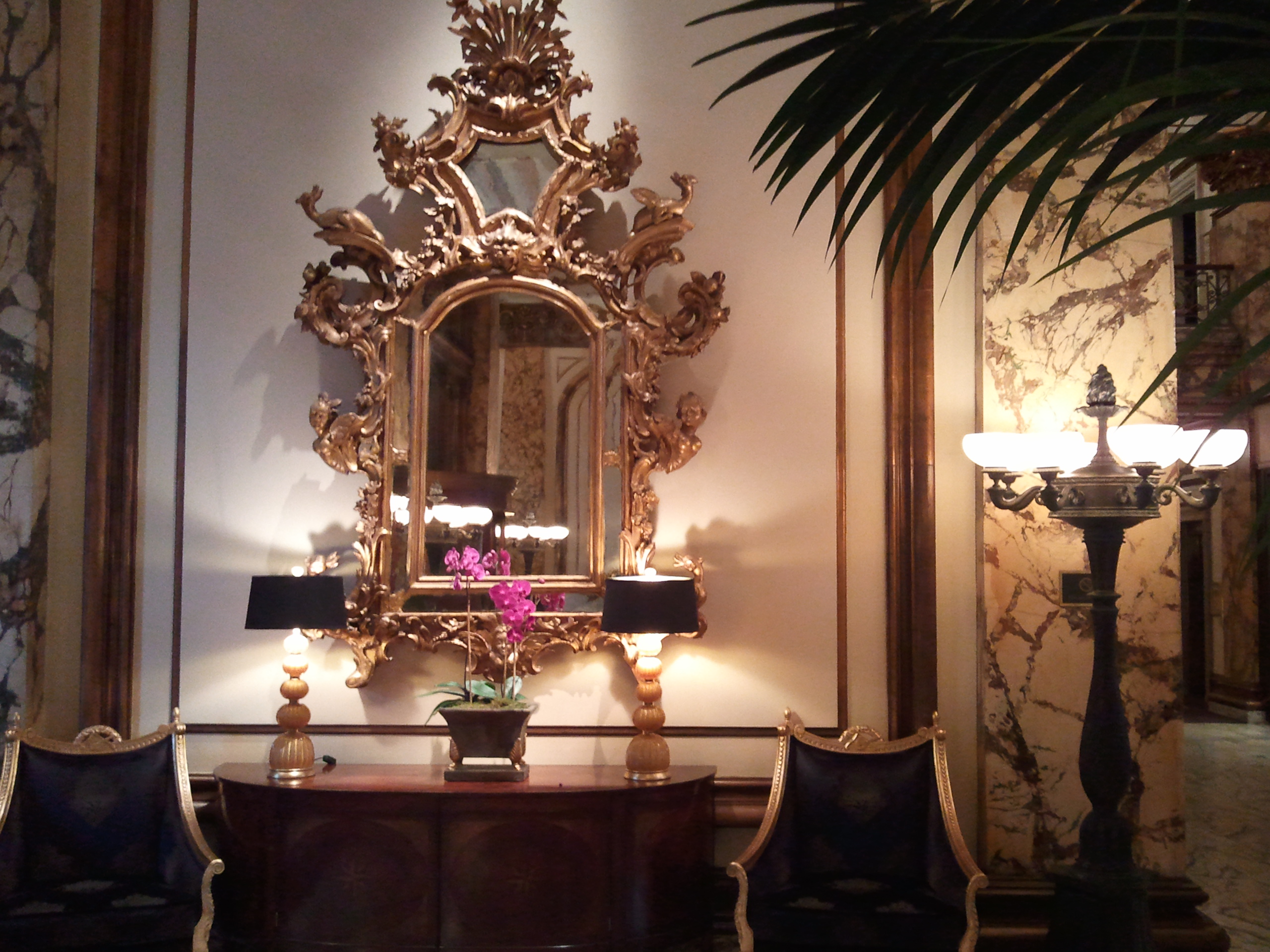
Rococo, also referred to as “Late Baroque”, is an 18th-century artistic movement and style, which affected several aspects of the arts including painting, sculpture, architecture, interior design, decoration, literature, music and theatre. [..]
With regards to interior decoration, Rococo rooms were designed as total works of art with elegant and ornate furniture, small sculptures, ornamental mirrors, and tapestry complementing architecture, reliefs, and wall paintings. (Wikipedia)
The definition of successful exterior or interior design was to create art with an almost unlimited level of detail, exceeding dramatically the required efforts that would be needed for solely functional design. As result, it was only for very few to enjoy.

I will spare you walking you through the complete history of architecture, but it’s clear Rococo has nothing to do with modern architecture, which exposes it’s beauty through function, clear lines and form, and simplicity. The building below located in Silicon Valley is a great example. A simplistic exterior and likely interior, but it very well could be the center of thriving startup, with millions of people currently connected to it’s services.

Web Design
The time span of web design is dramatically shorter, but there are clear similarities. Lets take as an example the Nike.com website. In 2000, as many other sites during that time, the experience was simple, only offering the most basic functionality.

With technology maturing, so did the experience. One of the highlights was clearly the Nike Air site of 2006, a firework of expressiveness, attracting users with an extraordinary visual experience.
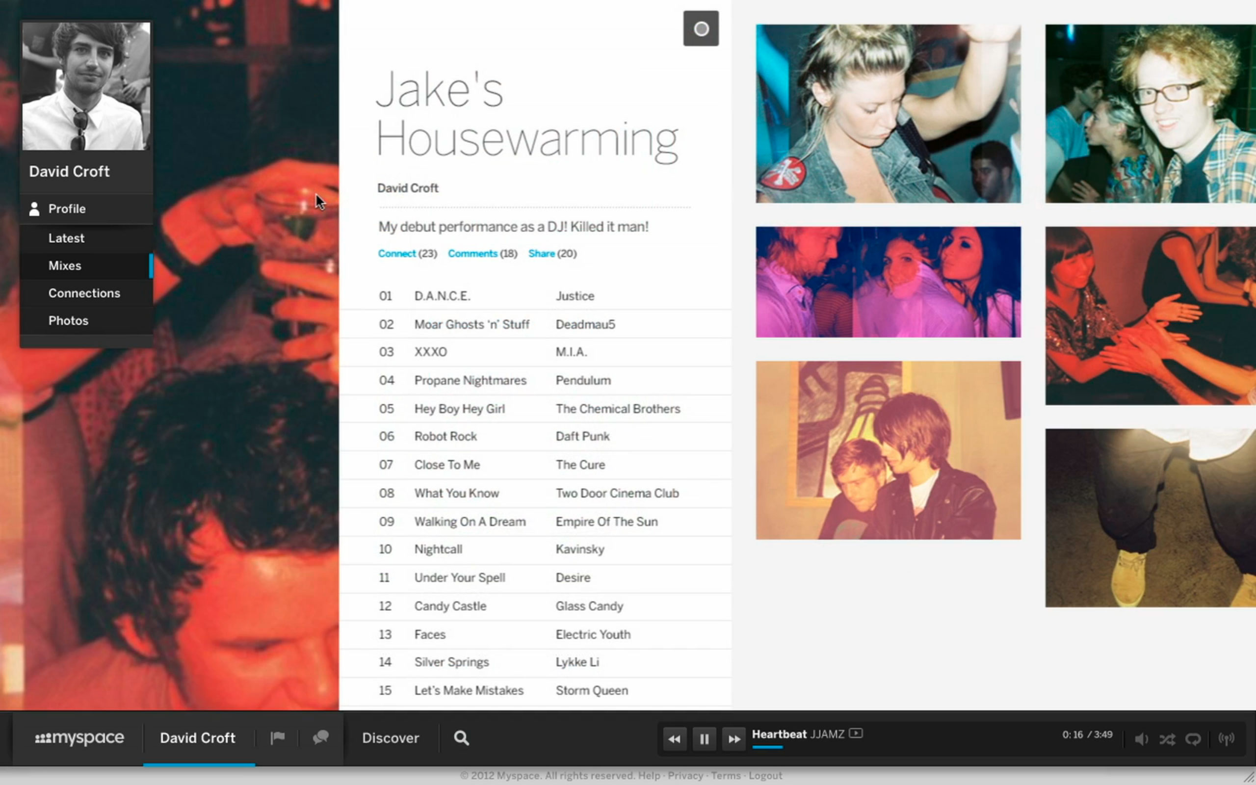
Fast forward to 2012, the experience is drastically more focused on functionality, social media integration, and more standardized video playback. Even though the experience is most simplistic, the connection to social networks and other channels is likely driving a significant amount of traffic.

Conclusion
There are clear parallels between the evolution of web design and architecture, and even though there is a lot of room for further exploration, it becomes clear that the web should be treated as an evolutionary art form focusing on experience, rather than a platform driven by pure technology evolution. It’s not hard to imagine that in 50 years the history of the web will be taught similar to the history of architecture today. And it’s up to you to write history.
And where to find inspiration? Joshua Davis makes it clear where to start – “If you are using the computer as a tool to make work, then that should be the last place that you go for inspiration”.
Read more about my personal thoughts about design and technology evolution in my original post.


1 comment on “Why The Web Is Like Modern Architecture”