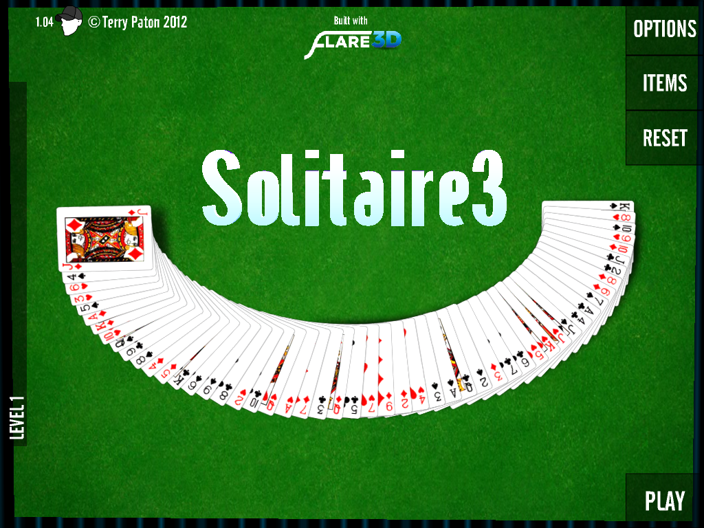
Wait what? Isn’t that a bit too enthusiastic, it’s just a Solitaire game? It is indeed, it’s not much different from any other Solitaire game, and technically there is no need to use Stage3D for something so simple. But by focusing on the details and user experience and using something as complex as Flare3D, the game on a sudden feels more responsive, the background moves gently, everything is very smooth and feels right. It’s the same concept, but the details are just a bit better than other 2D equivalents.
 Is this the demo you want to show to demonstrate the performance of Stage3D on mobile? Probably not. But it’s an example how a fully GPU accelerated UI with focus on detail can create a better experience, which made it my favorite Solitaire game. And for such a historic game, that’s an achievement.
It’s clear the future of AIR for mobile user experience belongs to Stage3D. 2D UI frameworks, GPU accelerated gaming engines and applications – we are back at the beginning, where everything is possible.
Download Solitaire 3 from the App Store.













I’d say it is a game to show off Stage3D. So often Adobe presos show massively, while impressive, experiences but that doesn’t open up the mind of devs to say “I can ‘sprinkle’ Stage3D/etc onto my app to improve the experience.”
[note: ‘sprinkle’ isn’t by any way attempting to lessen the work it took to smooth it out like this]
@johncblandii Yes, I think that’s exactly the point. This game is a great example how a bit of “sprinkle” can help.
Oh but I do agree…it is my favorite Solitaire game too. 😀