If you look back at web design the last 10 years, there was a clear line between technologies and interaction design. It was simple – a HTML site for everything that was serious, functional, and a Flash-based site for everything highly interactive, expressive, and marketing driven.
When a client asked for Flash site, they really didn’t ask for the technology, but a certain level of expressiveness. With HTML5, and vastly improved tools to author it, such as the Edge Tools & Services, the line is starting to vanish – HTML5 sites are capable to be highly expressive, and more and more consistant across popular browsers.
It seems that sites that were designed very conservatively and simplistic in a past, get redesigned will an increased willingness for improved interactivity and expressiveness.
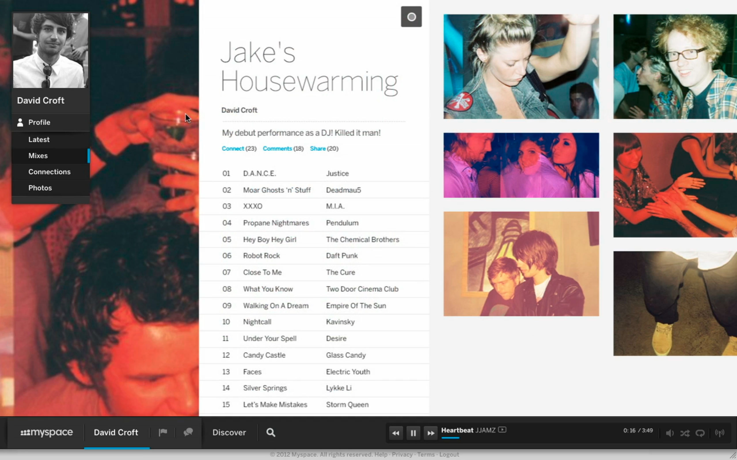
Let’s look at Myspace.com with a vastly enhanced design – highly interactive, and very smooth:
Another example is USA Today by Fantasy Interactive, one of the recipients of the recent theFWA The Cutting Project of the week sponsored by Adobe.
 The site is highly interactive, with transition animations that clearly remind you of a very Flash centric user experience – built by company that became famous with their Flash sites.
Are those isolated cases, or does this potentially introduce a new area of highly responsive, HTML5 based websites? Did we move on from the mantra of simplicity? If this is indeed the case, it underlines the premise of my Webdesign architecture comparison, and how web design iterates very quickly.
That said, it’s amazing to see the web evolve – and as long as we don’t introduce “skip intro” animations again, it certainly keeps it exciting.


